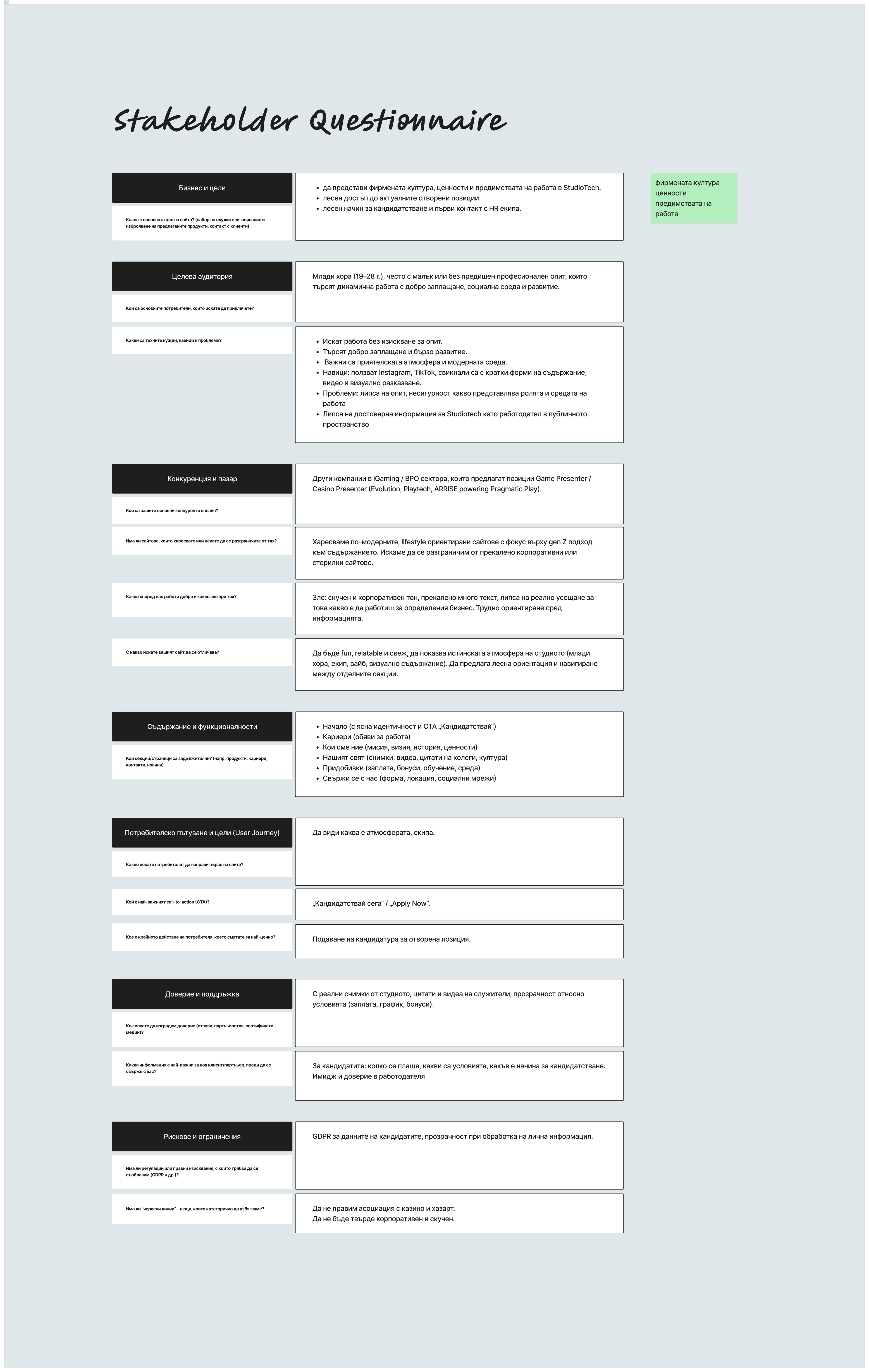
The stakeholder interview clarified that the website’s main goal was to position StudioTech as an authentic, modern employer by clearly communicating culture, values, and real working conditions, while making the application process simple and accessible. The target audience—young candidates aged 19–28—expects visually engaging, concise content and values transparency, growth, and a positive work environment over corporate formality. These insights drove a culture-first, trust-building UX approach with a clear “Apply Now” flow, humanised content, and strict avoidance of overly corporate or casino-associated messaging.
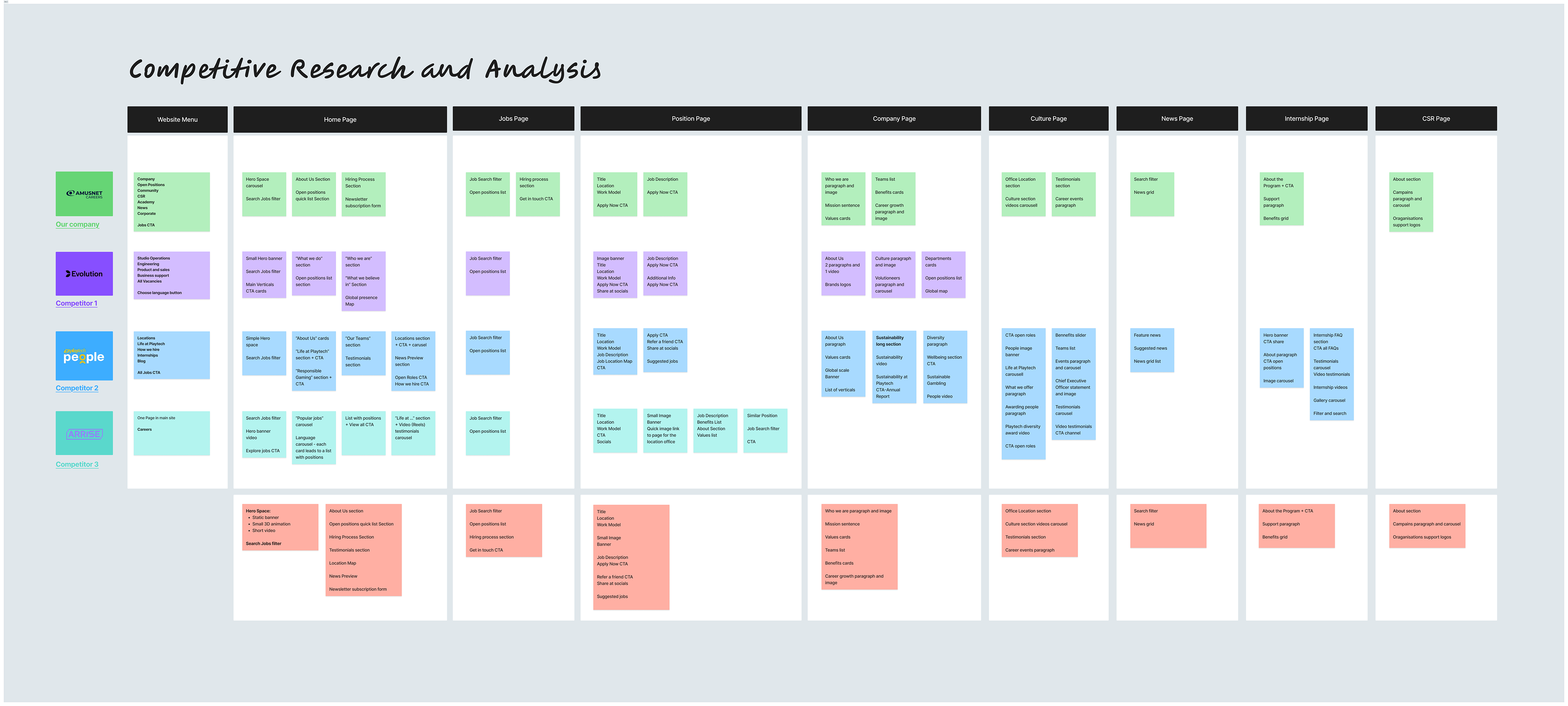
The competitive analysis showed that most industry career websites rely on similar structures—home, jobs, position, culture, and company pages—but often feel text-heavy, fragmented, and overly corporate. While competitors cover functional requirements well (job search, descriptions, CTAs), they tend to underperform in conveying authentic culture and emotional appeal, especially for Gen Z–oriented candidates. These gaps informed a strategy to keep a familiar information architecture while differentiating through clearer hierarchy, reduced friction, and stronger culture-led storytelling.
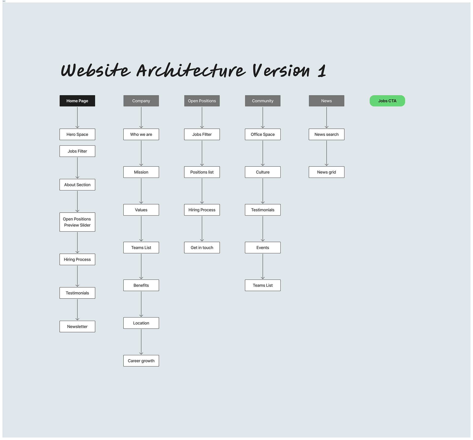
The first version of the website architecture established a clear, conventional structure with five main sections—Home, Company, Open Positions, Community, and News—supported by a persistent Jobs CTA. The Home page was designed as a guided funnel, gradually introducing culture, open roles, and social proof before explaining the hiring process, aiming to build confidence before action. While the structure covered all key content needs, it also revealed early signs of depth and repetition across sections, highlighting opportunities for simplification and stronger prioritisation in later iterations.
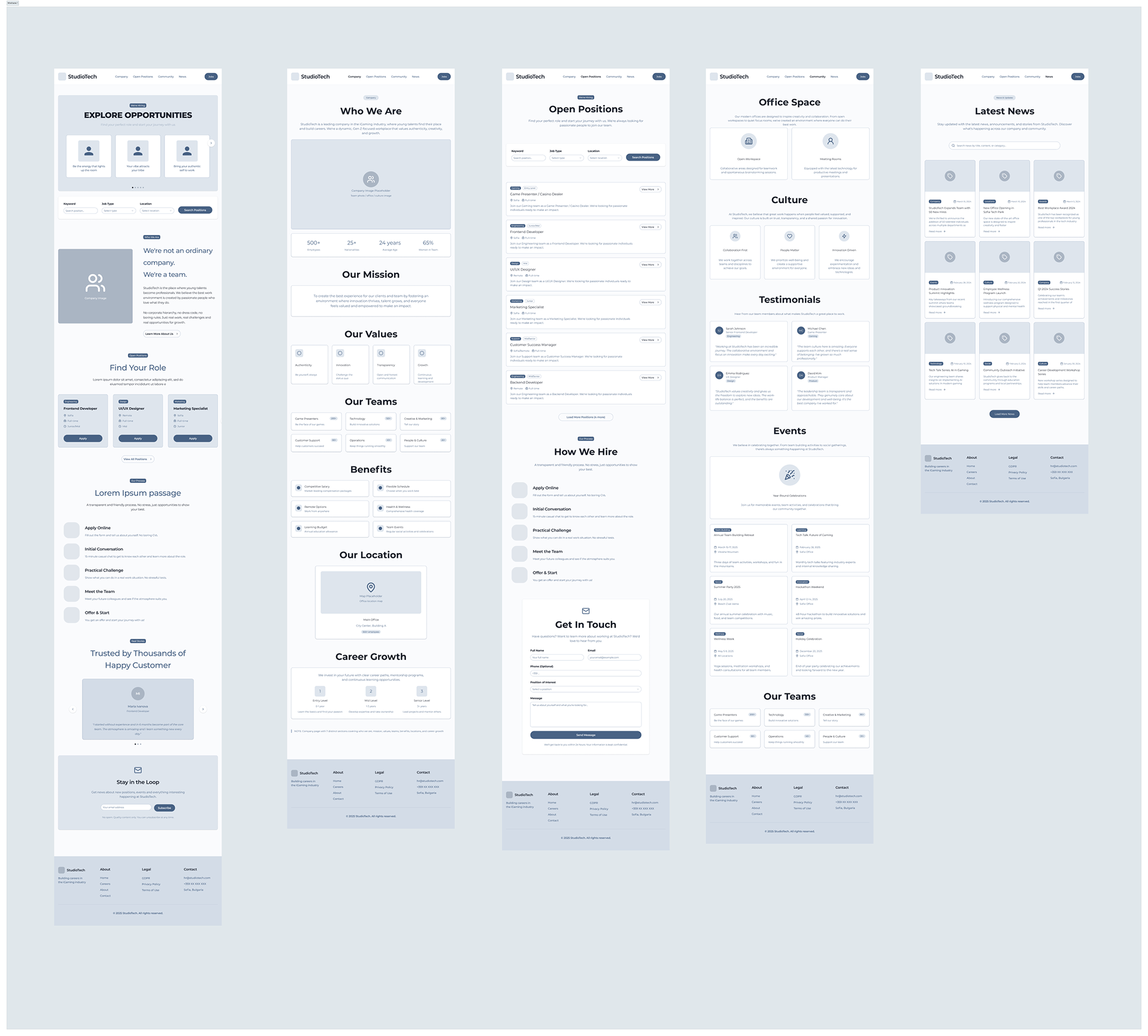
The first wireframe version established a clear, content-rich structure that balanced fast access to open roles with gradual culture and trust-building. Each screen followed familiar patterns to reduce friction, while using testimonials, values, and real workplace signals to humanise the employer brand. While effective in coverage, the layout revealed opportunities to shorten page length, reduce repetition, and strengthen focus on the main application path.
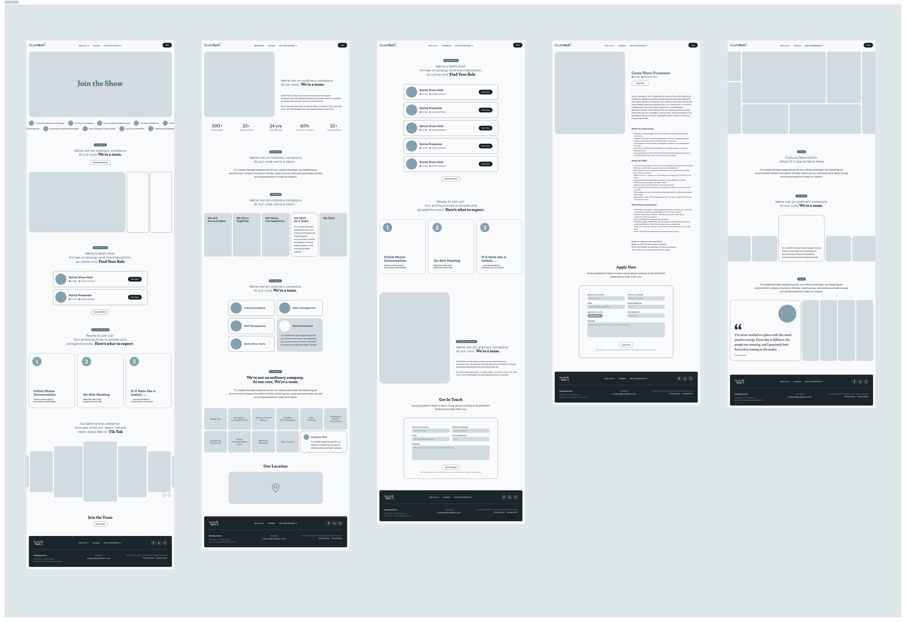
The second wireframe iteration refined the structure by tightening hierarchy, reducing visual noise, and bringing the job search and application flow into stronger focus. Content was reorganised to surface open roles and key actions earlier, while culture, values, and social proof were presented more selectively to support—not compete with—conversion. This version improved scannability, shortened page depth, and created a clearer, more confident path from discovery to application.
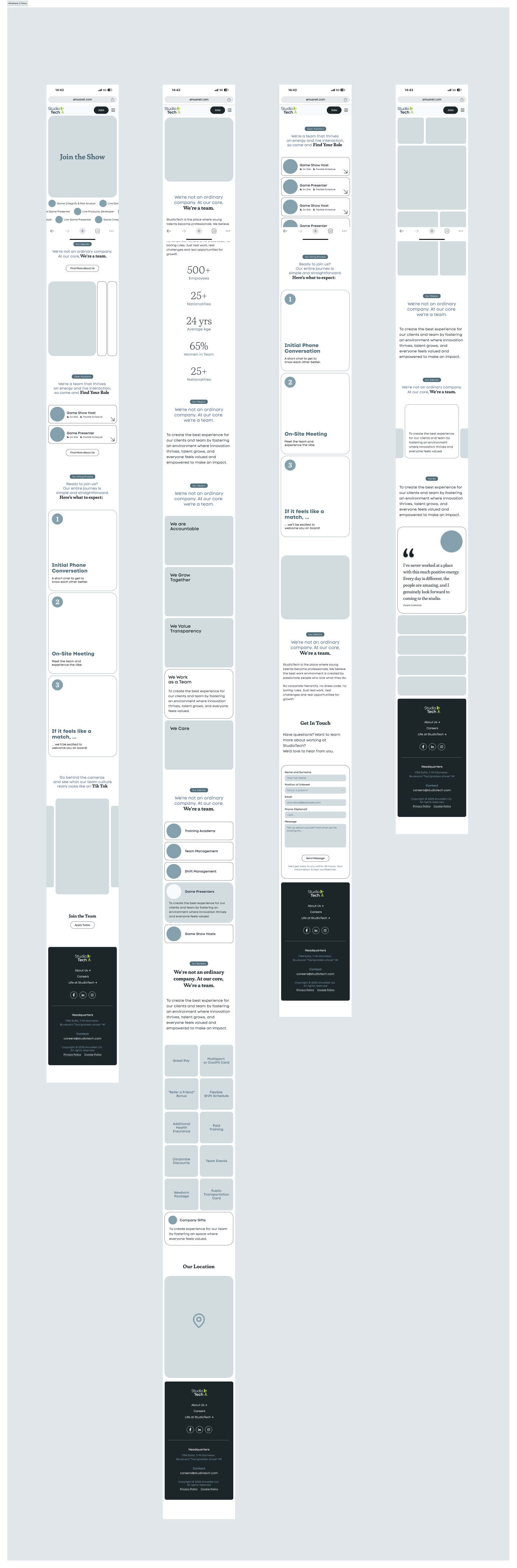
The mobile wireframes for Version 2 translated the refined desktop structure into a focused, scroll-efficient experience tailored to small screens. Content was prioritised to surface open roles, key messages, and CTAs early, while secondary information was stacked logically to avoid overload and excessive scrolling. This approach improved clarity, maintained narrative flow, and ensured the application journey remained fast and intuitive on mobile.